Tauihi Basketball Aotearoa is set to change the face of women’s basketball in New Zealand; it is a unique competition which inspires the next generation of young kiwi women to aim higher, both on and off the court. As a product for fans, it will deliver a high level of professional women’s basketball action, featuring an exciting mix of homegrown and overseas talent, which will also help grow and develop our next generation of Tall Ferns.
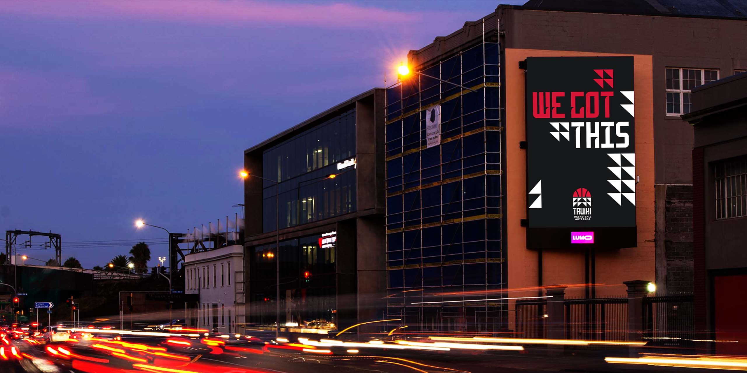
Working in collaboration with Basketball New Zealand and advertising agency EightyOne we developed the branding
for the league and its five franchises.
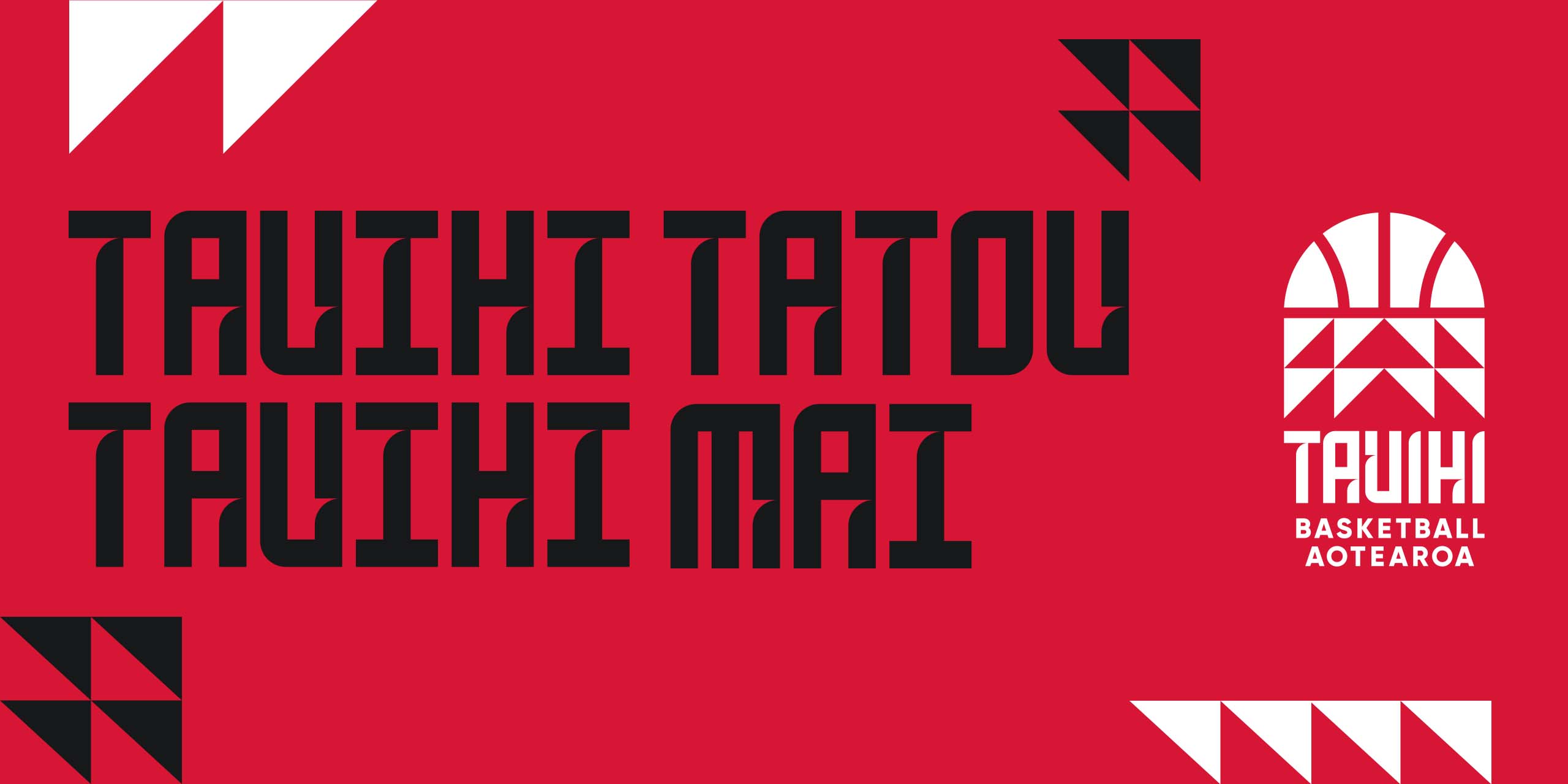
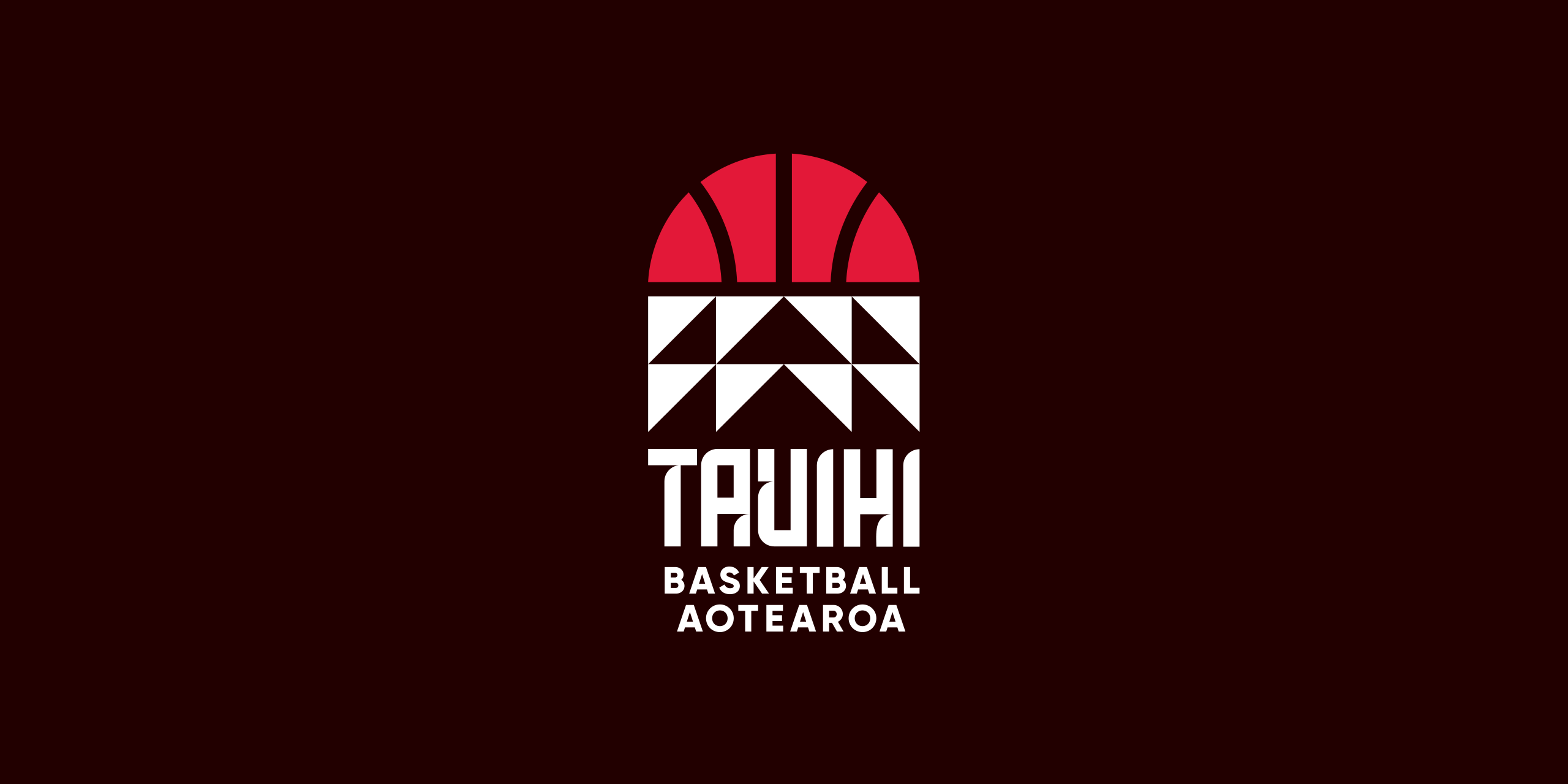
The logo is a representation of a basketball swishing through the net. The rounded top half shows a basketball just before it dissapears through the hoop. The second half is the net which is made up of simple taniko/tukutuku triangle pattern.
The pattern itself is a combination of the Niho Taniwha
and Aronui designs. These patterns symbolise determination, tenacity, and striving for excellence, and the pursuit of knowledge.
Look closely and you can see an arrow design within the taniko pattern. This symbolises our name Tauihi...to soar.
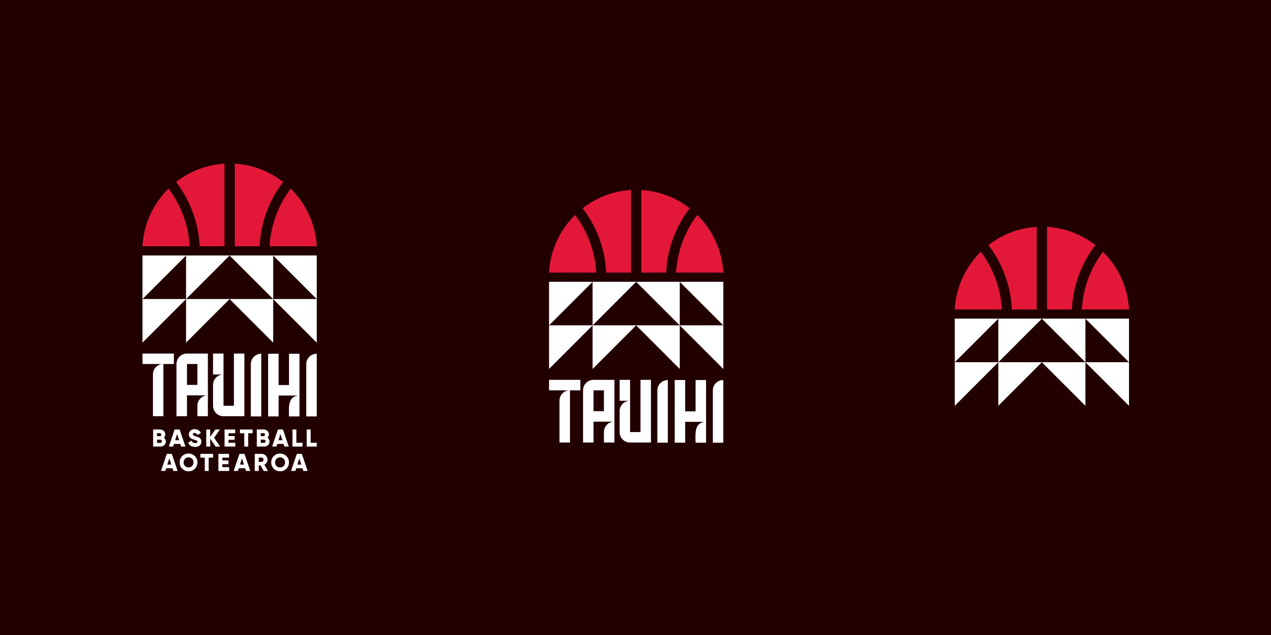
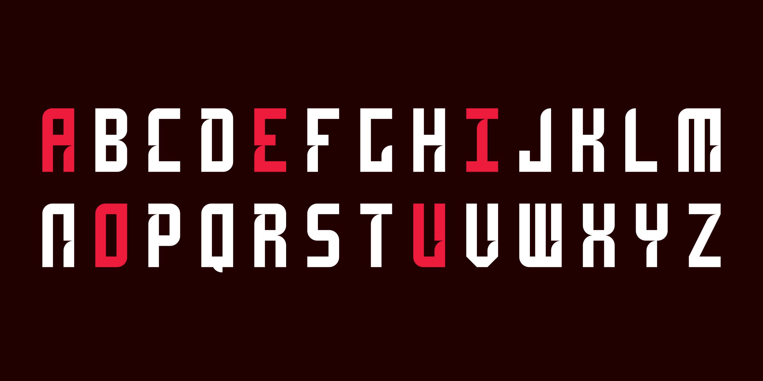
The brand mark, also features a bespoke typeface that takes cues from the geometric shapes found in traditional Māori tukutuku panels and merges those with the round curves of a basketball.
The intention was to make the letters look like they are moving, even though it is static. The curved terminals give our bespoke typeface a sense of energy and movement.
