Client:
Rongowhakaata Iwi Trust
Channels:
Brand Identity
Web Design
Business Collateral
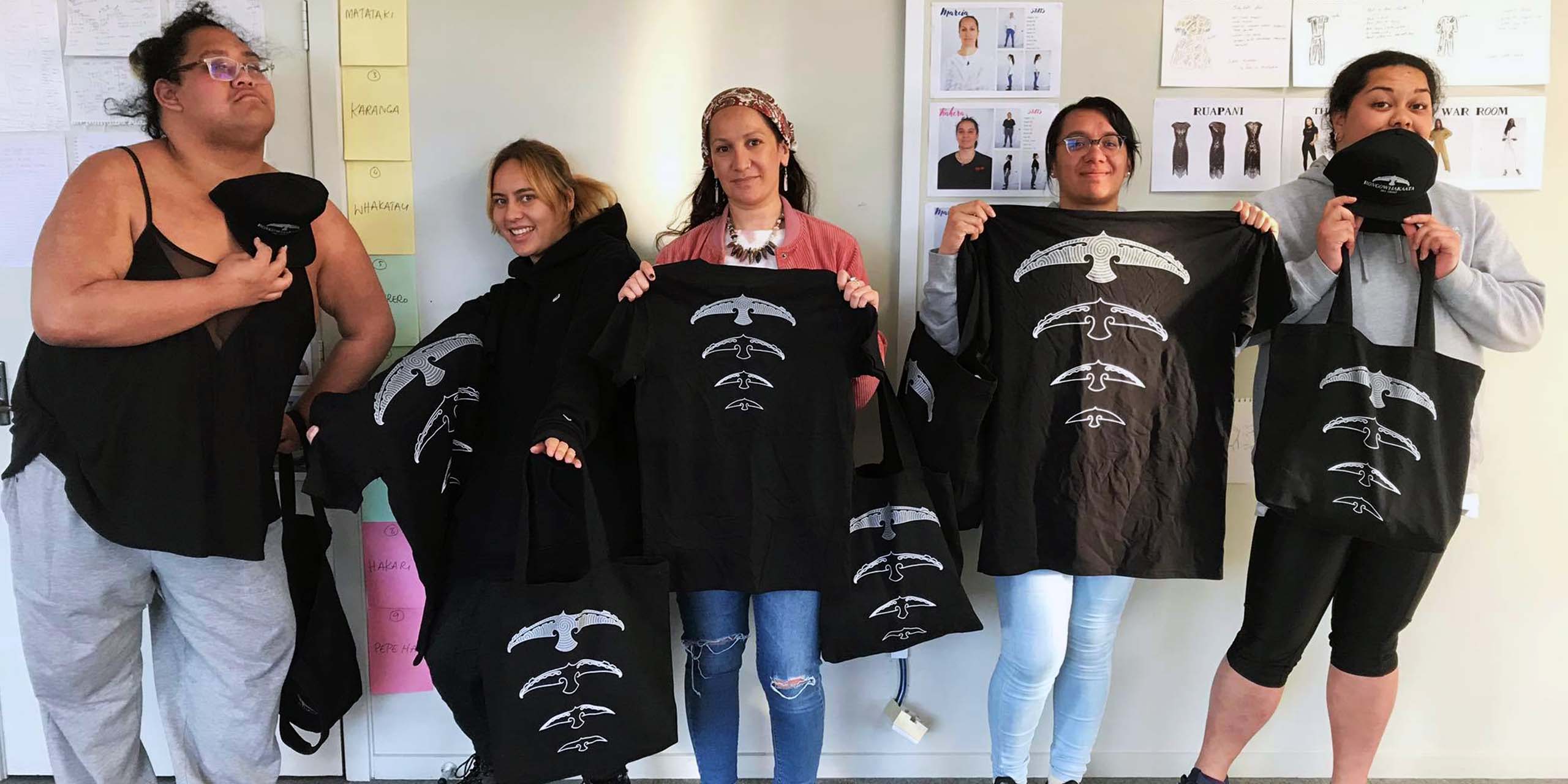
Merchandise
Contributors:
Tama Ratapu
Ephraim Russell
Mareikura Brightwell
We worked with Rongowhakaata Iwi Trust to help evolve and refresh their visual identity. We developed a tohu that is inspired by the history of Iwi and the stories about their tipuna Rongowhakaata.
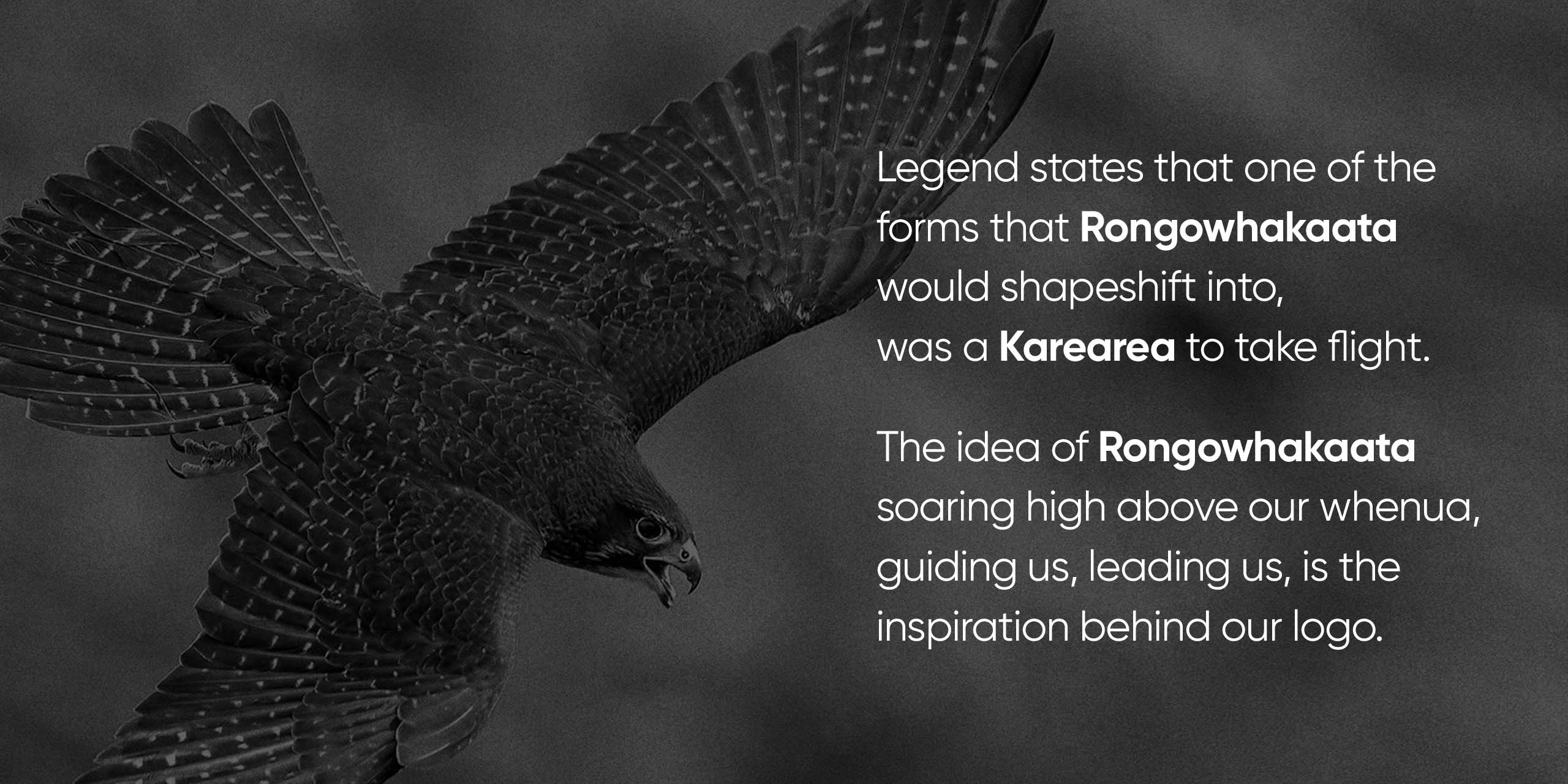
Legend states that one of the forms that Rongowhakaata would shapeshift into, was a Karearea to take flight. The idea of Rongowhakaata soaring high above our whenua, guiding us, leading us, is the inspiration behind our logo.
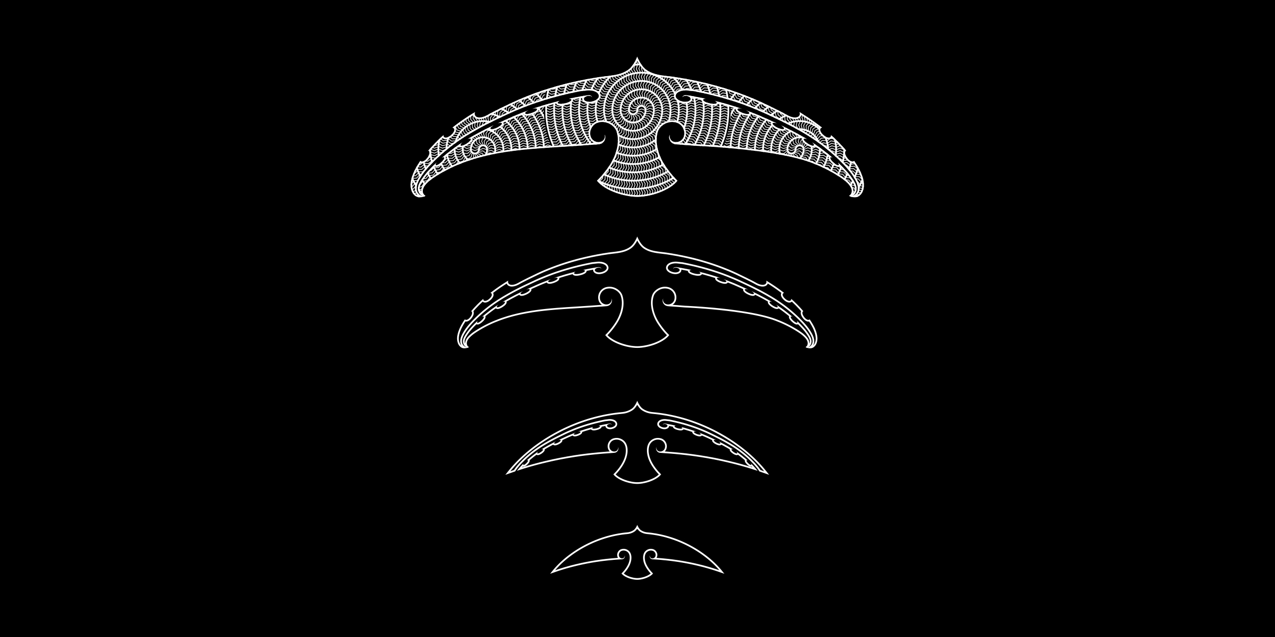
The tohu is a portrayal of movement through the sky, the shifting of feathers, swooping wings. The intrinsic nature of the kowhaiwhai has a rhythmic flow depicted in a reoccurring design.
The two kōwhaiwhai patterns explored in our tohu are
Pitau-a-Manaia and Rua Kūmara.
Pitau is often rendered in positive form depicting naturalistic associations to the fern frond of manaia or Pitau-a-Manaia; depicting the double spiral motif that engages both positive and negative spaces. Pitau is one of the earliest figurative representations found in kōwhaiwhai.
Kape Rua references the ceremonial planting and harvesting knowledge associated with kūmara, such as the arrival of the kūmara through our tīpuna Hinehākirirangi. The stylistic nature of the pattern takes the form of a Rua Kūmara (Storage Pit) - Kape being the impression left behind in the land.
